

The Psychology of Packaging Design
5 min read28 November 2014


For bees, the most attractive flowers are the ones with the brightest colours. We’re a bit like bees in that we tend to be attracted to packaging that ‘jumps out’ at us; and it can be easy to let our instinct for attractive packaging override our better judgment when making purchases.
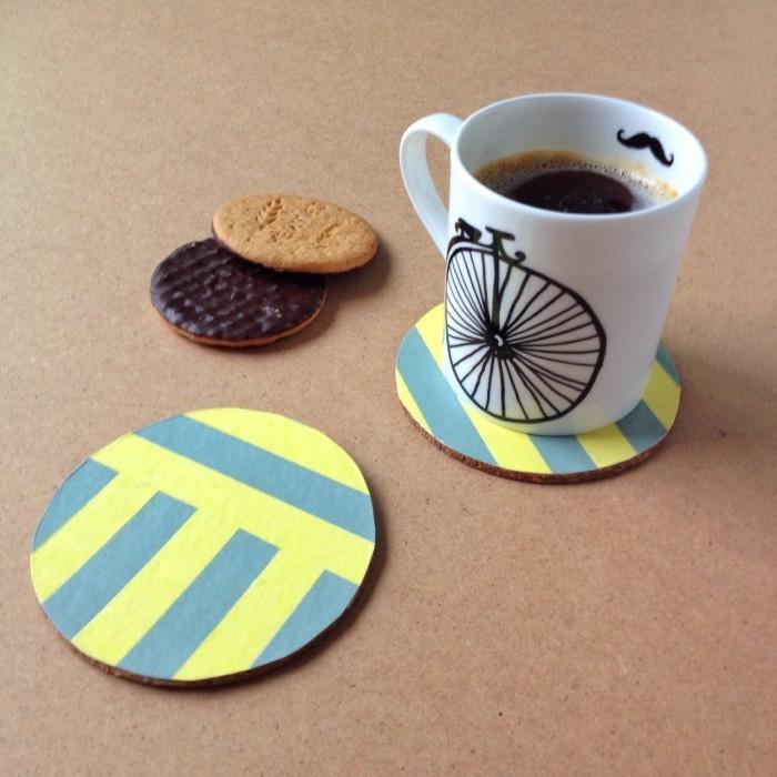
It’s no secret that product packaging is designed to make us pine for the product inside. Just picture a product displayed in the Apple store; rows of moulded plastic cases filled with pops of colour. It’s the same feeling children get in sweet shops.
Product marketers often call on psychologists to determine what shifts products off the shelves and into consumers’ hands. Their ultimate aim is to make us buy and they do this with persuasive marketing techniques such as using colours, textures, words and shapes to signify that their product will enhance our lives.
Ultimately, it’s about psychological triggers that bring out the inner child (a natural reaction) in all of us. If packaging can make us feel excited, eager, safe or secure – and persuade us to buy the products within – then marketers can rest easy knowing they’ve done their jobs.

Why are so many things packaged?
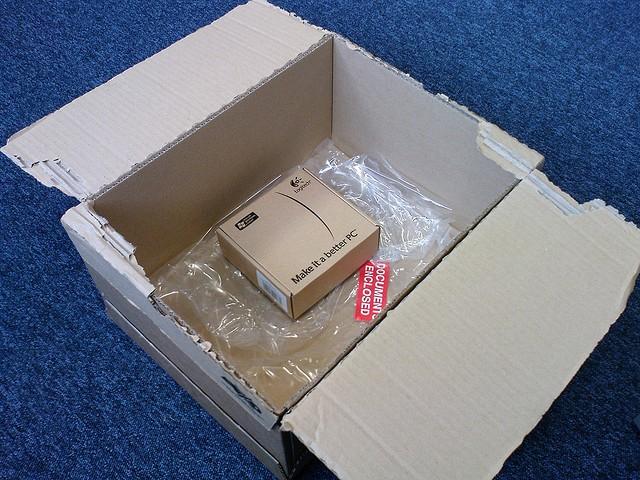
Occasionally, you may find yourself wondering why many things are packaged the way they are. Do bananas really need to be bagged in plastic? Do cucumbers really have to be shrink-wrapped? If retailers want to sell them, then the simple answer is yes. An attractive package instils us with confidence to trust and in turn stay loyal to the product.
The history of packaging psychology is well-documented, and the word ‘purity’ features a lot. Take Quaker Oats, for example. When the brand was established in the 1870s, it was the first brand of pre-packaged oats available; previously they had always been sold out of barrels. Co-founder Henry Seymour decided that this made Quaker Oats more “pure” and so he decided to name the brand after the Quaker faith, with its connotations of religious purity.
Were they significantly different to any other oats? Probably not. But the idea caught on, and three-quarters of a century later, the sterile environment of the 1950s supermarket summed up our obsession with shrink-wrapped purity. “To the developed world imagination,” says Susan Willis in a study on packaging, “the open-air markets of the developing world are a riot of impurities. In the developed world, the package is the fetishized sign of the desire for purity.”
Why does shape matter?
You may think it doesn’t, but the shape of the packaging and texture can have a direct effect on how well an item sells. If consumers are compelled by an attractive or unusual shape, it’s more likely that they will choose that product.
It’s the reason why, for the past thirteen years, bottled water brand Evian has collaborated with designers such as Diane Von Fürstenberg and Jean-Paul Gaultier to produce shapely glass bottles of water decorated with 3D-textured prints, retailing at around £7.00. The product contained within is no different to the usual Evian offering – and a comparable plastic bottle costs just 80p!

It’s not just the style-savvy who are prepared to pay a premium for less product volume either. In 2013, Coca Cola launched a 250ml ‘slimline’ can in the UK, aimed squarely at the health-conscious. Perhaps unsurprisingly, the slim can is only a tiny bit cheaper than the brand’s standard 330ml can.
Slender packaging can imply that the product within is healthier and will, in turn, make the consumer more slender. Some have even suggested that certain packaging (such as washing up liquid bottles) is designed to resemble the female shape.

The importance of colour
As the most obvious feature of product packaging, colour, has the most potential to affect our perception of a product. Colour is by far the easiest way to make packaging reach out to consumers.
Stroll down the aisles of a toy superstore or sweet shop and you’ll see that the shelves throng with colour. Any parent will be well aware that this works to capture the attention of children! Take a nosy round a health food store, however, and you’ll find a very different scene. All the packets are decorated in colours that look safe and mature – including tans, vegetable hues and watery blues.
The comparisons are endless. The metallics, greys and whites used to package digital goods and cleaning products appeal to efficient and modern people. Pastels are light-hearted and feminine. The neon shades that adorn the bottles of energy drinks and nachos can suggest energy, youthfulness and vitality.
We might like to think that we base our shopping decisions on price and quality – and to some degree, we do. But colour does continue to form a huge part of our unconscious buying habits. Which would you perceive as safest: the neon pink and bright green box of baby formula? Or the soothing pale blue box? Fortunately marketers can test different ideas through market research to minimise the risk, before the product packaging is trialled on the market.

Hi!
Love the article. Although I miss some of the psychological principles or examples. Like what kind of shapes can I use otherwise?
I’ve found some examples here, maybe you can also add some more?
https://www.amsterbrand.com/en/implicit-marketing/65-packaging-psychology-an-implicit-association-guide-to-successful-packaging-design
Cheers,
Tim